Brand Potential x Albert Heijn – Partners in Private Label Possibility
Albert Heijn wanted private label to lead, not follow. By fusing Brand Design and Insight & Innovation across Terra, Protein with a Capital P, Delicata, Care and more, we turned thousands of SKUs into distinctive, trusted brands that define how AH shows up in people’s homes.
The Potential
Transform Albert Heijn’s vast private‑label portfolio from “own label alternative” into a suite of distinctive, design‑led brands that can compete with – and often outperform – A‑brands, while responding to shifts in food, beauty, health and sustainability across thousands of SKUs.
The Insight
Shoppers don’t think in “own label” versus “A‑brand” – they think in trust, taste, design and how products show up in their homes and lives. If a retailer can combine deep everyday familiarity with bold, emotionally resonant brands, private label can become the preferred choice, not the compromise.

The Idea
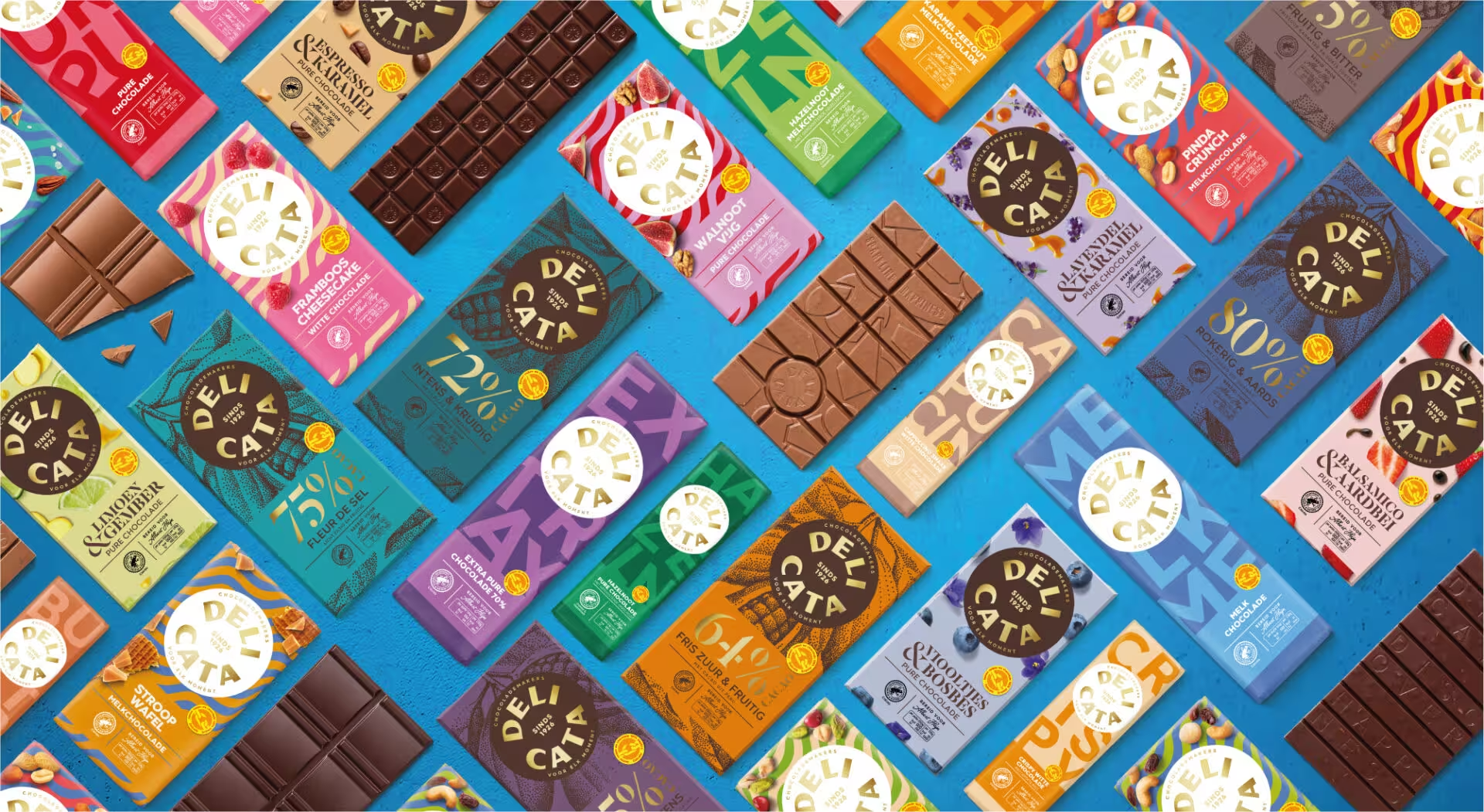
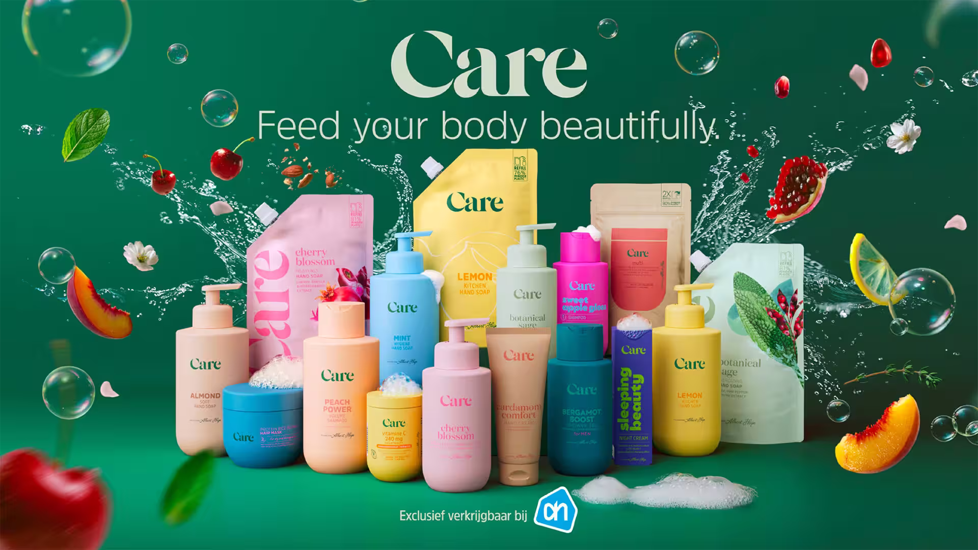
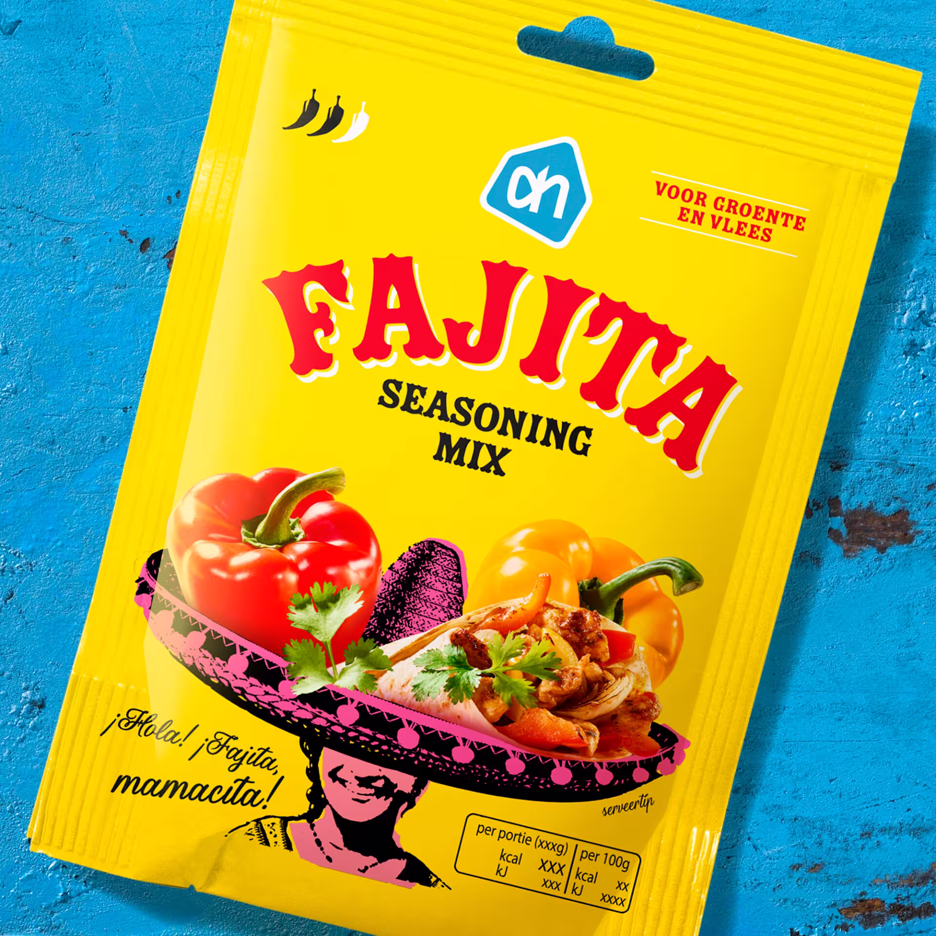
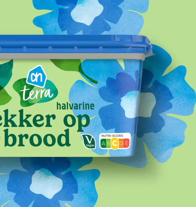
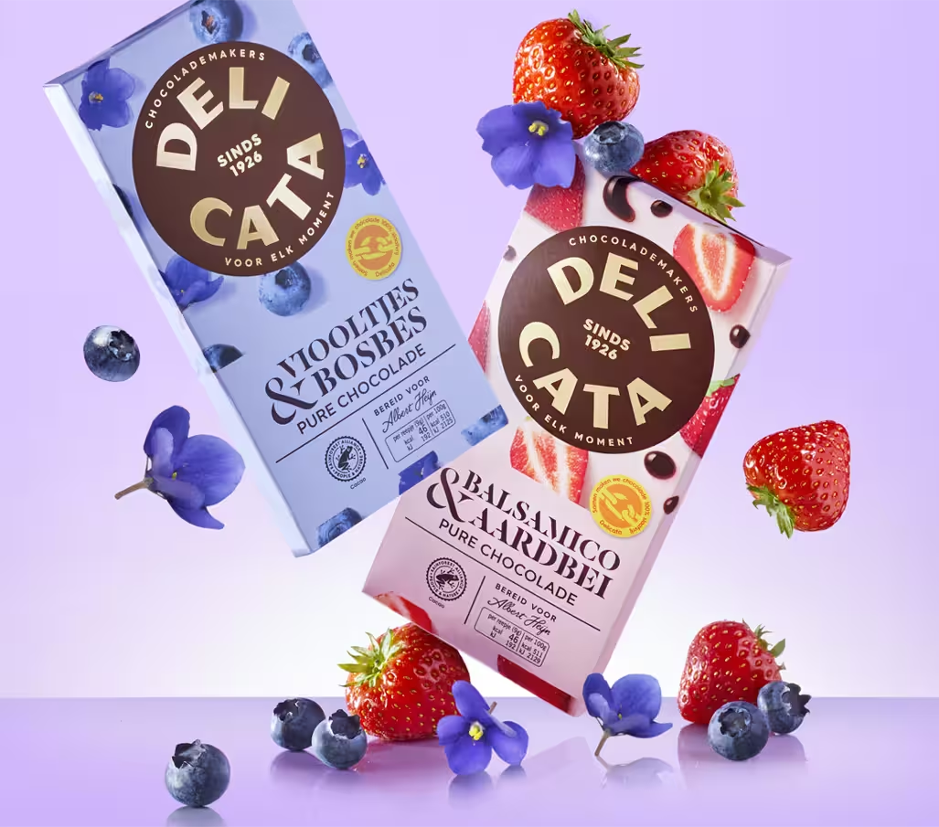
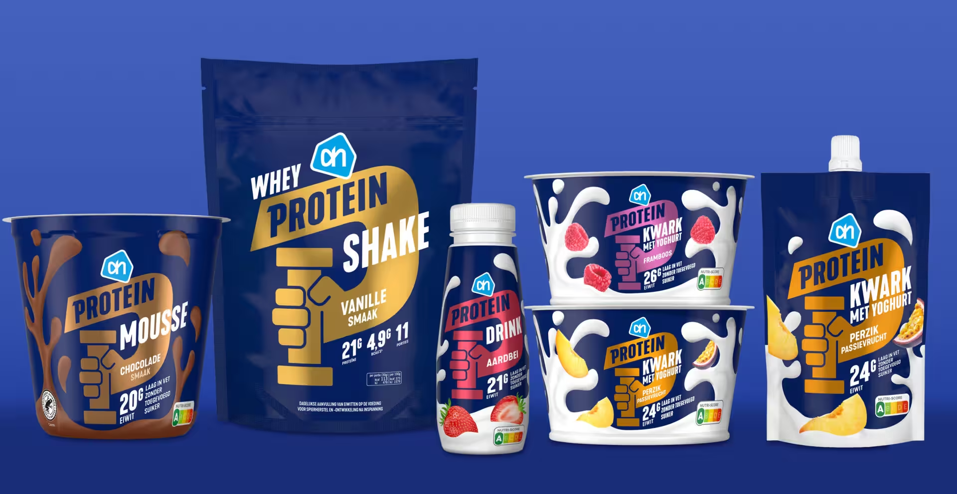
Build a long‑term creative and strategic partnership where Brand Potential operates as an extension of Albert Heijn, using insight‑led brand design to turn private label into a portfolio of powerful ecosystems – from plant‑based (AH Terra) and high‑protein (Protein with a Capital P) to heritage chocolate (Delicata) and food‑inspired personal care (Care).


The Impact
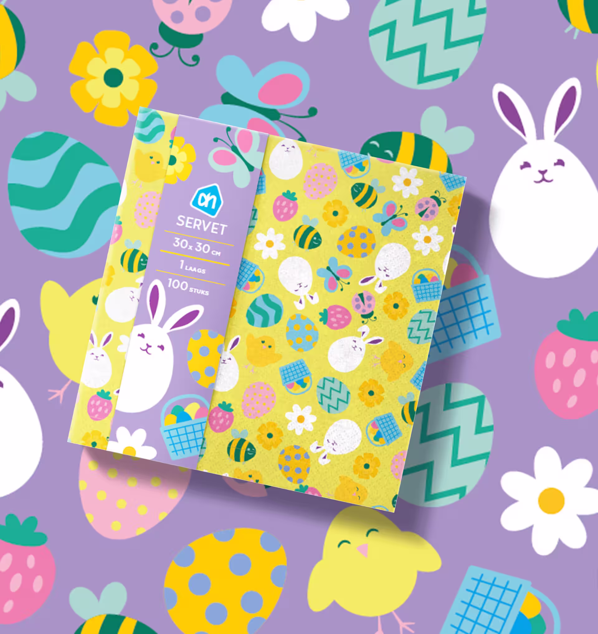
- Private label evolved from “basic alternative” to category‑leading brands across food, beauty and seasonal ranges.
- Creation and relaunch of multiple flagship brands (e.g. Terra, Protein with a Capital P, Delicata, Care).
- Stronger brand recognition and navigability across ~20,000 AH own‑label SKUs, supporting market leadership and international expansion ambitions.
- Shifted shopper perception of private label from functional to desirable, design‑driven and values‑aligned.
- Helped normalise plant‑based eating, protein lifestyles and sustainable self‑care through everyday supermarket choices.
- Turned AH’s private labels into the visual and emotional “face” of the brand in people’s kitchens, bathrooms and celebrations.
“The design of our private labels is the face of Albert Heijn in people’s homes. Brand Potential understands that better than anyone – together we’ve turned ‘own label’ into some of our most loved brands.”
Related Content