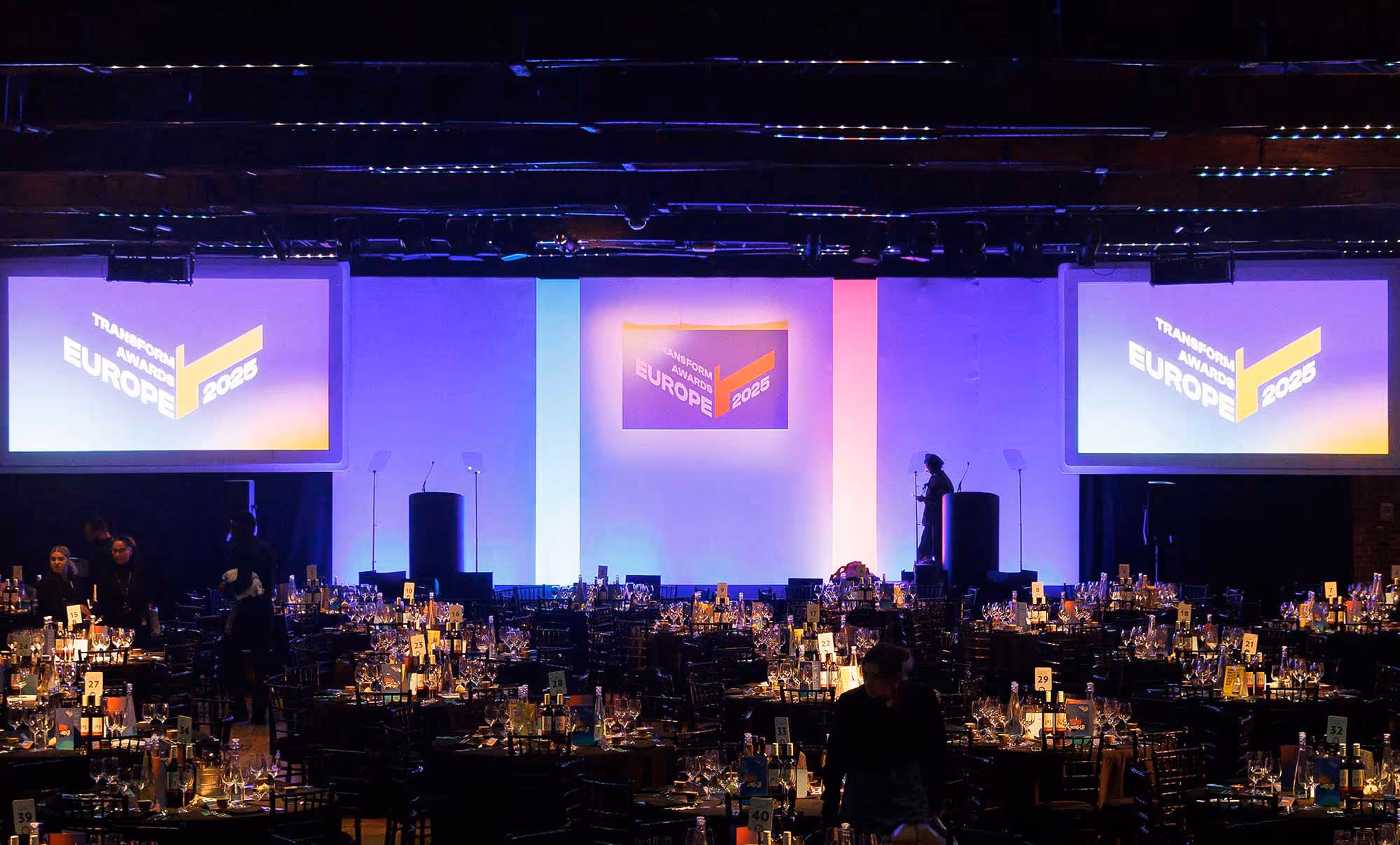
Triple Success at the Transform Awards 2025: How We’re Fusing Identity + Impact to Drive Growth
At this year’s Transform Awards, Brand Potential took home three wins for our work with Microhive and OGX (Kenvue). These awards prove what happens when you connect brand meaning with commercial momentum.
Collective Confidence: Three wins for Brand Potential
Awards are more than just trophies on a shelf. For us, they are a validation of our model: a marketing collective that fuses human ingenuity + machine intelligence to unlock new routes to growth.
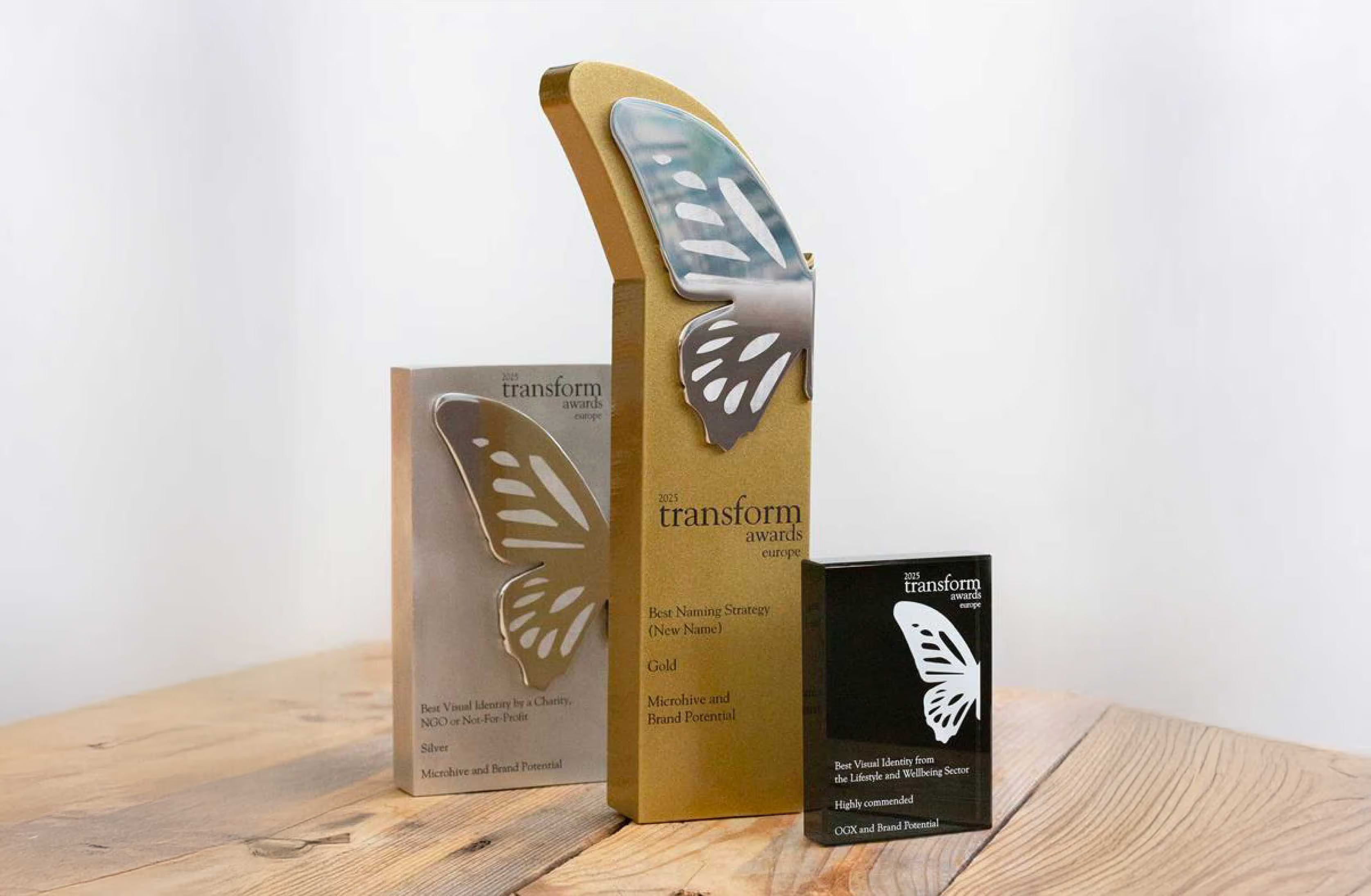
We are thrilled to share that Brand Potential walked away with three awards at the Transform Awards 2025, recognising our work in naming strategy and visual identity
- Gold: Best Naming Strategy (New Name) – Microhive
- Silver: Best Visual Identity by a Charity, NGO or NFP – Microhive
- Highly Commended: Best Visual Identity in Lifestyle & Wellbeing – OGX (Kenvue)

Gold in Naming: Turning a label into a launchpadA name is often the first point of contact between a brand and its potential. For the organisation formerly known as ‘Pennies From Heaven’, the name had become a barrier. Our research revealed it felt dated, carried religious connotations, and lacked the gravitas needed for global corporate engagement.
We stepped in to redefine their identity from the ground up. Our naming strategy focused on four distinct territories: Evocative, Descriptive,Mash-ups, and Aspirational.The result was Microhive. It’s a name that elegantly captures the essence of their mission: ‘Micro’ for the individual contribution, and ‘Hive’ for the collective power of community. By creating a name that was modern, memorable, and scalable, we didn’t just give them a new label, we unlocked their potential to revolutionise charitable giving on a global scale.
Silver in Identity: Design that drives 67% new business growthVisual identity should do more than look good; it should perform. For Microhive, we moved away from an uninspiring "clip art" aesthetic to create a sophisticated, hexagon-inspired system.
This wasn't just about aesthetics. We designed a visual language that symbolised four core business elements: change, continuity, collective giving, and charity. We paired this with a vibrant, ambitious colour palette and an optimistic tone of voice. The impact of this Brand Potential partnership was immediate and measurable:
As Microhive CEO Kate Frost noted, this rebrand has positioned them to"shape the landscape of charitable giving for generations to come.
- 67% increase in new business.
- 25% growth in web traffic
- 19% more participating organisations.
Highly Commended: Premiumisation that wins on the shelf
Our work with OGX (Kenvue) to create the Rescue Fusions sub-brand was a masterclass in balancing brand + performance. The challenge was to enter the premium retail segment while staying true to the core OGX DNA.
We evolved signature brand assets like the hair wave pattern and introduced premium finishes like holographic foiling and a clean white base.This created a sophisticated visual language that bridged the gap between mass-market and salon-quality.
The commercial results speak for themselves:
- Rescue Fusions now accounts for 16% of all OGX sales.
- Two variants broke into the Top 10 OGX products.
- The Overnight Serum became the second best-selling product in the brand's history.
Why this matters for future-focused brands
These wins reflect our core belief: the future belongs to brands that connect what others keep apart. Whether it’s naming, visual identity, or retail strategy, we fuse deep craft with diverse perspectives to amplify impact.
When you partner with a collective of specialists, spanning insight, innovation, strategy, and design, you don't just get a new look. You get a new trajectory.
At Brand Potential, we help brands rethink how they show up for people at every life stage, combining human insight + machine intelligence to unlock new sources of growth.
We are Brand Potential. Partners in Possibility.